The Friday Alaska Landmine column: Permanent Fund "Performance"
This week, we compare the returns being generated by the Permanent Fund and the benchmarks the PFC uses against more broadly known measures like the S&P 500, DJIA & Nasdaq
Last June, during the height of the issues surrounding former Permanent Fund Corporation (PFC) Trustee Ellie Rubenstein, we wrote a column focusing on the Permanent Fund’s performance against its own benchmarks.
As we explained there and in a previous column, the PFC publishes three benchmarks against which it measures its overall performance. It describes them this way:
PASSIVE INDEX BENCHMARK: VALUE ADD This short-term performance indicator is based on a blend of passive indices reflective of a traditional portfolio consisting of public equities, fixed income, and real estate investments. The objective is to earn regularized income to support the liquidity needs of the Fund while outperforming a passive global index portfolio of stocks, bonds, REITs, and US TIPs.
PERFORMANCE BENCHMARK: PEER COMPARISON This indicator is a blend of indices covering all asset classes, reflective of the Fund’s target asset allocation.
TOTAL FUND RETURN OBJECTIVE 5%: REAL RETURN The long-term investment goal is to achieve an average real rate of return of 5% per year (CPI/inflation +5%) at risk levels consistent with large public and private funds.
The third benchmark—the “Total Fund Return Objective 5%”—is especially important because it measures whether the PFC is achieving the 5% “real” (after-inflation) return embedded in AS 37.13.140(b), the statute governing the calculation of the Legislature’s annual percent-of-market value (POMV) draw. If the Permanent Fund fails to achieve that objective consistently, continuing the POMV draw at that level will gradually erode its value.
As we wrote then, while the PFC’s performance against its self-selected benchmarks was generally positive on a 5- and 3-year rolling average, a one-year rolling average revealed worrying signs.
These worrying signs have continued since. As some readers know, we update our analysis of the PFC’s performance monthly as the PFC publishes its results. While the 5-year rolling averages remain relatively strong against the benchmarks in our most recent analysis, the one-year rolling averages show continued weakness, which is understandably also beginning to affect the 3-year rolling averages.
In a later column, we also began tracking the management fees the PFC pays. As we explained in that column, while the fees started at relatively modest levels, they have escalated significantly.
In FY 2024, for example, the management and profit sharing/performance fees paid by the PFC totaled nearly $800 million, or almost 1% of funds under management, for a year in which the Fund’s overall return fell below all three PFC benchmarks. Had the fees been half that amount, more in line with the level paid by Norges Bank [which manages Norway’s huge Government Pension Fund – Global (GPFG)], instead of a .07% differential, the Fund’s overall return would have been within roughly 0.02% percentage points of meeting its Total Return Objective of 5% over inflation.
While seemingly regular before, the PFC has not published any quarterly reports covering the management fees since that column. As a result, we don’t know what fees the PFC has paid in two quarters since the last report.
Against these measures and costs, we sometimes hear calls for a comparison of the PFC’s results against better-known measures of investment performance, such as the Standard & Poors (S&P) 500, the Dow Jones Industrial Average (DJIA), or the Nasdaq 100. To reduce costs, we also hear calls from some, rather than to continue to maintain the stable of employees and consultants currently retained by the PFC, to invest all or most of the Permanent Fund in mutual or exchange-traded funds that track one or more of the indices.
To assess the reasonableness of those suggestions, we decided to compare the results of those indices against the returns generated by the PFC. The results are interesting.
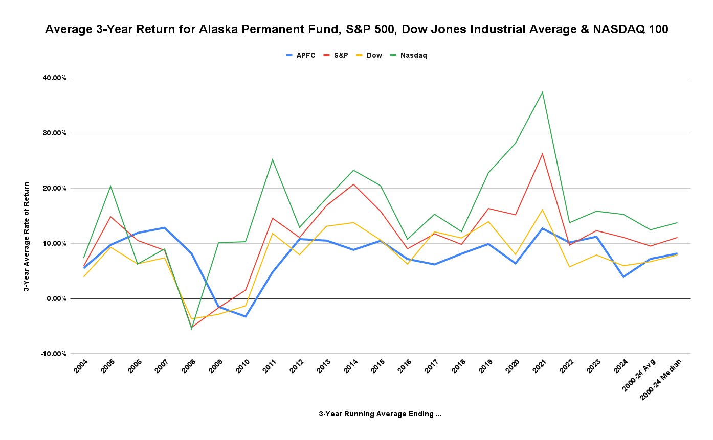
The following chart compares the running 3-year average returns – the average annual return realized over the prior 3 years – realized by the PFC since 2000 (in blue), calculated from the returns shown on the chart on the “Our Performance” page of its website, to the running 3-year average returns realized over the same period by the S&P 500 (red), the DJIA (yellow) and the Nasdq 100 (green), calculated from the annual returns published for each.
Over the period, the Nasdaq has performed best, producing an average return of 12.45% and a median return of 13.75%. The S&P 500 has ranked second, producing an average return of 9.50% and a median return of 11.06%. Compared to the others, the PFC has ranked third, producing an average return of 7.18% and a median return of 8.15%. Of the four, the DJIA has come in last over the period, producing an average return of 6.67% and a median return of 7.88%.
The average return is the simple arithmetic average of all periods in sequence. The median is the point at which half of the periods are above the number and half below it. A higher median than average usually means a few very low values at the lower end of the distribution pull the average down. In contrast, the median remains relatively unaffected by the outliers. Both are used to help assess financial performance.
We also have looked at the comparisons on a running 5-year average.
While the returns differ somewhat from the 3-year averages, the order is not. The Nasdaq still produces the largest returns over the period, with an average return of 14.07% and a median return of 16.18%. The S&P 500 is still second, with an average return of 10.34% and a median return of 12.46%. The returns from the Permanent Fund are still third, with an average return of 7.47% and a median return of 7.57%. The DJIA is still last based on average return, with an average return over the period of 7.25%, but moves up slightly to next to last based on median return, with a median return of 8.76% (compared to the Permanent Fund’s of 7.57%).
While these look at the various portfolios based on return, there are other important characteristics that produce different results. For example, the PFC returns are much less volatile than the others. Using standard deviation as the measure of volatility, the PFC returns have a standard deviation of 9.5, compared to 14.4 for the DJIA, 18.6 for the S&P, and 29.8 for the Nasdaq. Also, compared to the S&P and the other measures, the PFC portfolio has a beta – a measure of risk – of less than 1; in other words, it is less risky than any of the others.
For those who argue that, given the purpose of the Permanent Fund, steadiness – i.e., low volatility – and low risk are more than, or at least equally as important as, overall return, the PFC portfolio clearly has an advantage over the others.
However, even for those who prioritize steadiness, occasionally considering the broader world can be helpful when evaluating the performance of the Permanent Fund and, through that, the performance of the PFC.
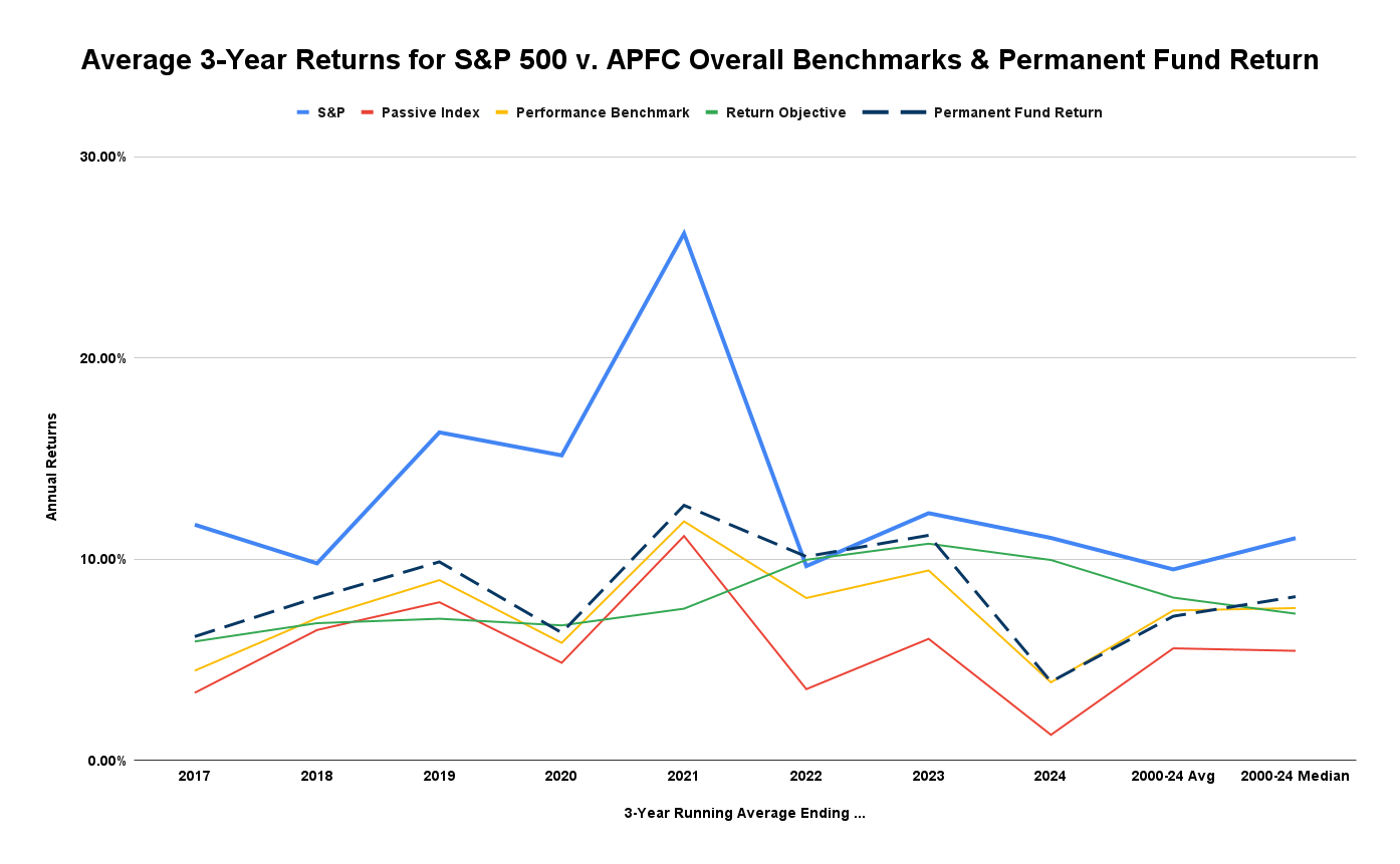
Here are the 3-year returns for the S&P 500 compared to those for the benchmarks currently used by the PFC and the Permanent Fund itself. The time period reflects the period over which the PFC has used its current benchmarks.
While certainly more volatile over the period, even at the low end, the 3-year average returns from the S&P 500 (in light blue) clearly outstrip the rolling returns from all of the PFC’s benchmarks and the Permanent Fund itself (dashed line). Against an average return of 14.03% and a median return of 12.01% over the period for the S&P, the PFC’s Passive Index (in red) has produced only 5.58% (average) and 5.46% (median) returns, the PFC’s Performance Benchmark (in yellow) only 7.46% (average) and 7.58% (median) returns, and the PFC’s Return Objective benchmark (in green) only 8.10% (average) and 7.30% (median) returns.
Comparing the Permanent Fund’s performance only against the PFC’s self-selected benchmarks leaves the impression that everything’s “sort of ok.” Despite some variances during the period, the average and median returns earned by the Permanent Fund over the period are close to those for the Performance Benchmark and Return Objective and higher than that for the PFC’s Passive Index.
However, comparing the Permanent Fund’s average performance over the period against the broader context provided by the S&P 500 leaves an entirely different impression. The takeaway is that using the current approach, the PFC is leaving money on the table compared to the results if all—or at least a significant part—of the Permanent Fund were invested in an S&P 500 mutual fund or ETF.
While others may be, we are not currently advocating an overhaul of the PFC’s portfolio approach. Given the Permanent Fund’s purposes, we believe the steadiness and low risk resulting from its current portfolio mix are valuable.
However, that conservative approach has limits, particularly if, as has occurred lately, the Permanent Fund’s performance continues to lag the CPI +5% Return Objective on which the Legislature’s annual statutory percent of market value (POMV) draw is based. Some take that as an indication that the Permanent Fund needs to be completely restructured by merging the corpus with the earnings reserve so that draws can continue even if current earnings don’t support it.
We think that is entirely the wrong approach, however. If that level of underperformance continues, a shift of some of the PFC’s lower-performing assets to an S&P 500 or other successful, index-based mutual fund or ETF may be warranted. There is no need completely to restructure the Fund if all that is needed is a shift of some of the Fund’s portfolio into more robust earning assets.


